Dashboards developed or in progress
Contents
Dashboards developed or in progress#
What are “dashboards”? These are interactive mathematical or data exploration applications hosted online and used in any standard browser. They are used to explore complex data sets, experiment with challenging concepts, or gain inspiration & insight from simulations.
Some design guidelines are on our “dashboards how-to” page.
Guidelines for teaching with dashboards are in our “Teaching and learning with Dashboards” tutorial.
See a short EOAS Dep’t news item about dashboards.
Climate science & oceanography:#
ocgy-dataviewer: observe and compare trace element and physical properties in the water column at selected locations in the Southern Ocean, the Atlantic and the North Pacific. Github repository is the “ocgy-dataviewer” folder here. Initially used as an assignment in EOSC 372 in the Fall term, 2021.
Global temperature: Contributions of several natural and anthropogenic factors to the global temperature anomaly are plotted for 1880-2005, with short explanations. Sketch interactivity is included. Github repository is the “globaltemp-factors” folder here. Initially used in EOSC 112 and EOSC 326 in the Fall term, 2021.
climate-mind-map, First draft HTML5 interactivity explored. Github repo. Instructors want to do a “paper” activity based on these ideas first.
Atmospheric CO2: Monthly averages at Mauna Loa and the South Pole, with user-defined straight line model for crude predictions. Github repository is the “co2-mlo-spo” folder here. Initially used in ENVR 300 in Winter term 2021, then updated for Winter term 2022.
climate-maunaloa-jnb, on github at repo, a Jupyter Notebook version of CO2 at Mauna Loa with straightline modelling. Uses
ipywidgetlibrary for interactivity instead ofPlotlyDash.climate-ozone plots 1 year of hourly ozone measurements at Vancouver Airport and Abbotsford. Github repository here.
Daisyworld displays inhabited area as a function of time when daisyworld parameters are varied. Both constant and varying solar flux situations are modeled. Github repository is the “daisy” folder here. Initially used in EOSC 310 in Fall term, 2021.
cmip6-lowcloud compares the trend in fractional low cloud cover in the eastern Pacific for a range of CMIP6 models and scenarios. Source: cmip6-lowcloud. To be incorporated into EOSC 340 in 2023.
cmip6-dash. General tool for comparing regional changes between CMIP6 models and scenarios for different climae variables. Source: cmip6dash. To be incorporated into EOSC 340 in 2023.
Geology and hydrogeology#
Storativity compares hydrological storativity of various geologic materials. Github repository is the “store” folder here. Initially used in EOSC 325 in Fall term, 2021.
Unconfined-flow interactive model of linar (“1D”) groundwater flow in an unconfined acquifer between two sources, with surface recharge included. Github repository is the “hydro” folder here. Initially used in EOSC 325 in Fall term, 2021.
Drawdown for confined and unconfined acquifers plots 2D drawdown curves for a well in a uniform acquifer with adjustable properties. Github repository is the “drawdown” folder here. Initially used in EOSC 325 in Fall term, 2021.
Ogata-Banks This is a 1D solute transport visualization aid. The app plots concentration as a function of distance along a 1D column, or at a location along that column as a function of time. Users can adjust velocity and dispersion coefficient, and the contribution from each of 2 components can be compared. Under development as of February 2023 (prototype as of 23/02/15 on “render.com” - slow startup, but a free service).
Mohr’s circles; plots Mohr’s circles and failure envelopes by interactively adjusting stress. Github repo. Initially used in EOSC 323 in Fall term, 2022.
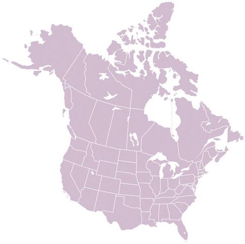
interactive images is an initial experiment exploring how to interact with figures for future dashboards planned for paleontology and other disciplines. Github repo and active app will be listed here when ready (~Dec, 2022). (Temporarily at onrender, 23/03/08. Input a figure via URL, for example try “https://www.eoas.ubc.ca/~quest/sketching/NorthAm-blank-sm.jpg”. It works, but is a little awkward, and a bit slow. Plans include trying an image annotation library other than Plotly.)
Geophysics or “signals”#
timeseries-3signals adjustable parameters illustrating noise and trend on a sinewave, with smoothing. Github repository is the “timeseries” folder here. Initially used in ENVR 300 in Winter term 2021, then updated for Winter term 2022.
timeseries-FFT (not online). On github at repo; works, but incomplete.
gpglabs Developed by the UBC Geophysical Inversion Facility (UBC_GIF) several years ago, this collection served as inspiration for OCESE dashboard devleopment. It is an extensive collection of interactive Jupyter Notebooks illustrating concepts in applied geophysics including forward & inverse modeling and physics. See the GPG applied geophysics textbook or the interactive NoteBooks collection repository.
Other dashboard ideas#
This is just a list of possible new dashboards. Each would require a sales pitch to relevant instructors (and or PME).
Augment any EOSC 111 activities with dashboards or JNBs.
Engineers: phenomenon behaviors (eg Mohr’s circles)
Darcy’s Law?
seismology?
complex numbers: relating 3 forms, Euler’s. Explore Kahn Academy for visualization ideas.
are apps at brilliant.org inspirational?
are lessons on Khan Academy inspirational?
are there ideas at SERC.
Re. the FFT dashboard:
search for precedent. Khan academy? FFT or iFFT demos/apps?
first pass at reconstructing signal with chosen number of F-series terms
what to explore for signal deconstruction? Find first N coefficients - i.e. generate a spectrum or power spectrum?
effect of sampling approaching Nyquist?
filters?