ENVR 300
Contents
ENVR 300#
Official description#
Introduction to Research in Environmental Science: Environmental research. Students investigate research methodologies and reporting in a range of scientific disciplines and fields.
Links:
OCESE project goals for ENVR 300#
Make in-class exploration of the “modeling process” interactive.
Provide a self-directed interactive resource to explore “signals, noise, trends & smoothing”.
Actions taken#
Two dashboards were built early during OCESE to learn how to design, build, test, and deploy Python-based dashboard apps.
Atmospheric CO2 at Mauna Loa and South Pole (monthly averages), with user-defined straight line model for crude predictions.
Three signals: adjustable parameters illustrating noise and trend on a sinewave, with smoothing. Signals, trends, noise and smoothing: a simple interactive dashboard app. to gain familiarity with interactions of these components of signals.
These were demonstrated to the ENVR 300 instructor and a decision was made to use the first during an inclass group-based learning activity and the second as a self-directed concept demo. Links to code repositories are on the OCESE project’s dashboards page.
Instructors’ experiences#
No work was required by instructors to build dashboards themselves, but in-class (online) teaching and learning workflow needed preparation. Results were considered efficient and effective; see below.
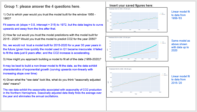
Workflow for delivering lessons: The CO2 app was first used as a fully online, in-class group activity. A Google Sheets document was prepared with one slide containing questions for each in-class group. Students followed instructions to run the online dashboard app, discuss questions, and submit their work during the in-class discussion session. Each group’s slide included space for answering the 4 questions and posting images captured from the work done with the dashboard. An example of one group’s work is given below.
Submitting work to a shared google document makes it easy to share work of all groups, and follow up directly during the lesson. The same work flow works well for in person or online lessons.
Students’ experiences#
Seven feedback questions were included as part of the activity. Students’ answered these on the learning management system (Canvas) with the following results:
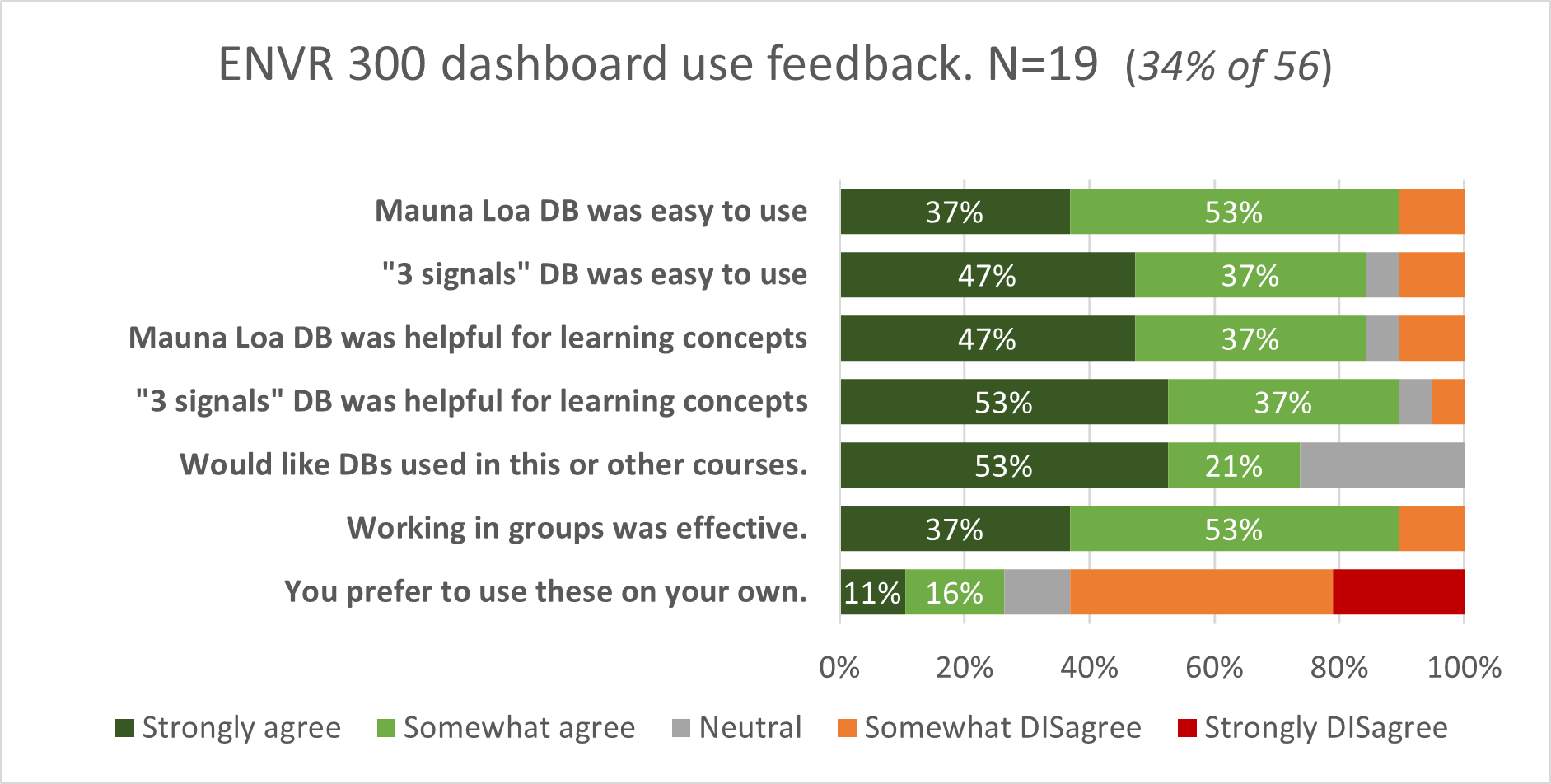
The clear positive implication from this small data set is that students found these resources effective and efficient and they want more. A few quotes from open ended questions follow.
What was the impact of using this facility on your instructing practice?
“The Google Sheets approach with a slide for each group worked so well that I might use it for normal in-person class work once we’re back in classrooms”. (This activity was was first piloted during COVID pandemic in the 3rd week of a fully online, zoom-based class.)
What did you like about learning with this facility?
“I liked how interactive it is and how we can see how things change when we choose different trends”.
“I like that these activities allow me to visualize concepts covered in class.”
“I like how interactive the dashboards were and how we were able to learn both individually and in a group simultaneously.”
Was there anything you disliked about the app?
“It would be helpful to fiddle with the activity individually first (so there’s not a lot of silence in the breakout rooms) and then discuss answers with other group members.”
“A little time could have been spent introducing the app and the issues (questions) being addressed during the activity.”
Costs#
An undergraduate worklearn student refined the code of the preliminary trial version. It should take roughly 10hrs for someone with a little experience with Python and the chosen libraries (Plotly in this case).
A second version was augmented a year later to address the ideas suggested by a second instructor. A second data set was added (South Pole CO_2), and minor adjustments were made to the way straight lines are adjusted. This update took roughly 16 hrs to update, test and redeploy.
Lessons learned#
Students like these and want more.
Prompt interaction with the instructor is a key for building to suite the learning and teaching needs.
As this was the second course to use OCESE dashboards, many of the guidelines in our dashboard development page became apparent while this app was developed, used, then updated.
The ability to instantly clip out a graphic result of working with the app, and pasting it quickly into a shared document, makes it easy to facilitate group work and “instant” discussion about results in class. Such rapid turn-around time is highly desirable for helping students learn without the delays imposed by submitting, grading, retreiving, and then not really reviewing results. Errors and misconceptions are addressed rapidly while the thinking is fresh.
Incorporating engaging, interactive resources to help students explore and experiment with concepts or data sets is not complicated. So long as the resources is ready and deployed on a suiteable server, it takes an instructor about as much effort as the introduction of any new learning activity or assignment.